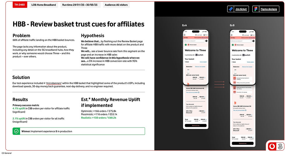
Case Study - Insights driven testing
Goal
We believed that introducing a plan calculator on the SIM page would help users filter according to preference.
Expected Outcome:
-
Users quickly narrow down plans based on plan length, data amount, and plan type.
-
Increased add-to-basket rates and SIMO orders.
Problem Statement
On the VodafoneThree SIM Only page, multiple named tariffs were displayed in a single, long list.
-
User confusion: Users struggled to understand the differences between plans.
-
Difficulty filtering: The flat list format did not allow users to narrow down plans based on their needs.
-
Overwhelming experience: Too many options presented at once created decision fatigue.
Comprehensive testing of personalisation and multivariate factors across the entire Three website.
What does success look like
Reached 'Significance' within 3 days of conducing an A/B test on the SIM Only calculator

11% increase in customers purchasing a SIM only plan within the Experience B group

Launched within BAU within a 6 week turn around and continually optimised

Documentation and Communication
Documentation
Keep detailed records of your design decisions, research findings, and user testing results.Collaboration
Communicate effectively with cross-functional teams, including developers, product managers, and stakeholders, to ensure a shared understanding of the design goals.
Process
Research & Insights
Analytics & Decibel recordings revealed users scrolling extensively but rarely compared plans
1:1 user testing & verbatim feedback users said things like:
“I don’t know which plan is best for me.”
“It’s hard to compare all these options at once.”
Users needed a guided, personalised way to find the right plan without scanning all 24+ tariffs.
Solution
To address the limitations of Experience A, I analysed the existing user journey and identified key areas for improvement. Rather than iterating on the current solution, I explored alternative directions by designing two concept concepts: Experience B and Experience C.
These mock-ups acted as exploratory tools to visualise different approaches, test assumptions, and demonstrate how the experience could better meet user needs. I shared both concepts with the wider team to facilitate discussion around feasibility, technical constraints, and audience fit.
This collaborative evaluation helped us align on a clear, user-centred direction that balanced design intent, technical capability, and business goals, informing the next phase of development.
Dynamic plan calculator redesign:
-
Users select preferences; only matching plans are displayed
-
Interactive filters: Adjusting filters updates results in real-time for easy comparison
-
Simplified choice: One optimal plan shown at a time, reducing cognitive load
-
Improved clarity & usability: Users can make decisions faster without scrolling
Evaluate
The chosen concept is built into a testable interface and rolled out to 50% of users over a 3 week period or until significance is hit.
Expected Outcome:
-
Quickly filter by plan length, data, and plan type
-
Increase add-to-basket rates and SIMO orders
Success Criteria:
-
+10% add-to-basket rate
-
+7.5% SIMO orders
Results
Experience B
15.3% of share of visitors adding SIM to basket
10.2% in CSIM conversion rate (significant)
Experience C
9.4% of share of visitors adding SIM to basket
4.8% in CSIM conversion rate (significant)
Experience B a winner, this was rolled out into BAU experience.


