THREE
Case Study
VODAFONETHREE
Contract SIM Optimisation
Redesigned the contract SIM screen to empower customer choice and ensure AI-search-friendly content.
MY ROLE
UX & User Research Specialist
Project Type
Conversion Rate Optimisation / UX Experiment

PROBLEM STATEMENT
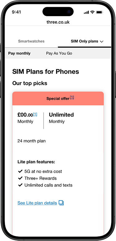
When users arrive on the Contract SIM Only page, they are initially presented with three airtime plans, with a total of 28 available if they choose to ‘load more’.
This can feel
• Overwhelming
• Difficult for users to scan or compare options
• Difficult to identify recommended or popular choices due to limited hierarchy and visual prioritisation.

EVALUATE EXPERIENCE
Seamless User Experience
RESEARCH
Following a review of the existing experience, several issues were identified that were negatively impacting SIM-only conversions:
• Analysis of page drop-off data highlighted significant friction at the plan selection stage
• A heuristic evaluation uncovered usability and hierarchy issues that made comparison difficult
QUALATIVE TEST WITH REAL USERS
• Heatmap analysis showed scattered attention and limited engagement with key decision points
• Market research revealed a gap between user expectations and the current presentation of plans
Together, these findings indicated that the existing experience was hindering user decision-making and reducing conversion, highlighting the need for a simpler, more guided journey.


PROPOSED SOLUTION
Looked at shifting control to the user by simplifying decision-making and reducing cognitive load by introducing a calculator. This results in:
• Helping users narrow choices based on contract length, data range, and plan type.
• Enable easier comparison and faster selection by guiding users through a personalised plan-selection journey.
• Taylor offers for specific SIM deals.
QUALATIVE TEST WITH REAL USERS
To validate the identified pain points, a number of rounds of qualitative user testing was conducted across both the existing journey and a number of proposed solutions.
This testing confirmed the issues outlined in the problem statement and provided deeper insight into how the new approach could better support user decision-making.
Tested three fully functional prototypes of the SIM Calculator experiences (Experiences A, B, and C) with 15 users in total.
• EXP A – Live site
• EXP B – 3 popular plans at the top in carousel, selectors for contract length and data, removing plan type
• EXP C - 3 popular plans at the top in carousel, selectors for contract length and data, data scrollable, removing plan type


USER TESTING FEEDBACK
Experiences B and C outperformed Experience A, with some observations
• Users generally preferred the Popular Plans presented in a scroll format, though they suggested adding more information between options.
• 3 plans displayed upfront and the plan selectors removed was heavily preferred
• Users responded positively to the “Build a Plan” CTA in Experience A.
• Users disliked the greyed-out selectors and responded negatively to the blue notification box.
• Users did not clearly notice the difference between data selectors when displayed stacked versus in a scroll format.
LIVE TEST
The test went out to 50/50 of traffic.
Results
B Significant
6.0% increase in add to basket
5.6% increase increase in conversion
0.9% decrease in visitors adding CHS to basket.
Although a decrease, this showed less 'ping pong' so resulted in a positive.
Rolled out to BAU.

RESULTS
Add to basket
6.0% increase
Conversion
5.6% increase
Add to cart bounce
0.9% decrease
© 2026 Rachel Barnes